BBC iPlayer TV Guide
Browse the TV Guide for programmes from the BBC and other broadcasters

Client
BBC
Future Media | iPlayer
Year
2015
London, UK
Case Study Overview
As Senior User Experience Designer, I have had the opportunity to work on various stages of the iPlayer TV Guide, from Concept and Wireframe to UX/UI/IX Design, Prototype, Mockup, MVT, and AB User Testing. Working collaboratively with Creative Direction, Product Managers, UX Designers, Users Researchers, User Testers, Software Engineers, and Developers, I have identified and addressed several problems that arose during the last testing session.
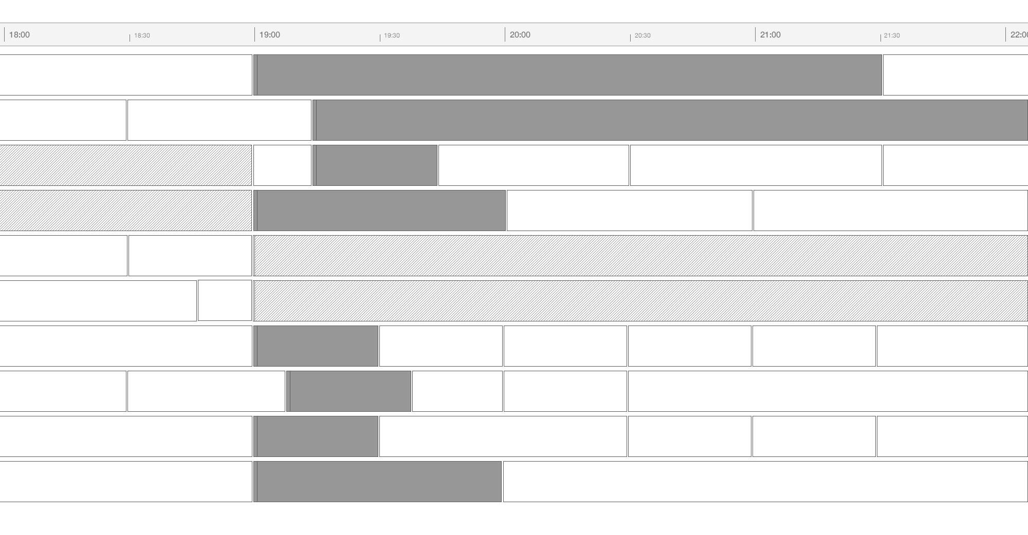
The main problems that needed attention were related to the lack of differentiation between the background color for "Off Air" and "Programmes Available to Watch" cells, the inconsistency of the hover background when hovering over the latter cell, the non-closure of the More panel when scrolling through the schedule, the non-stickiness of the "Off Air" text and the "Watch Live" programme when scrolling through the schedule, the abnormal appearance of the cell when the programme duration is less than five minutes or one minute, and the lack of smooth schedule transition when continuously clicking the navigation arrows. Additionally, the navigation arrows were not sticky when scrolling the page up and down.
To improve usability and accessibility, the main challenge was to provide a clear overview and quick access to live programmes and re-think users' interaction on live programmes and facilitate access to all programme information.
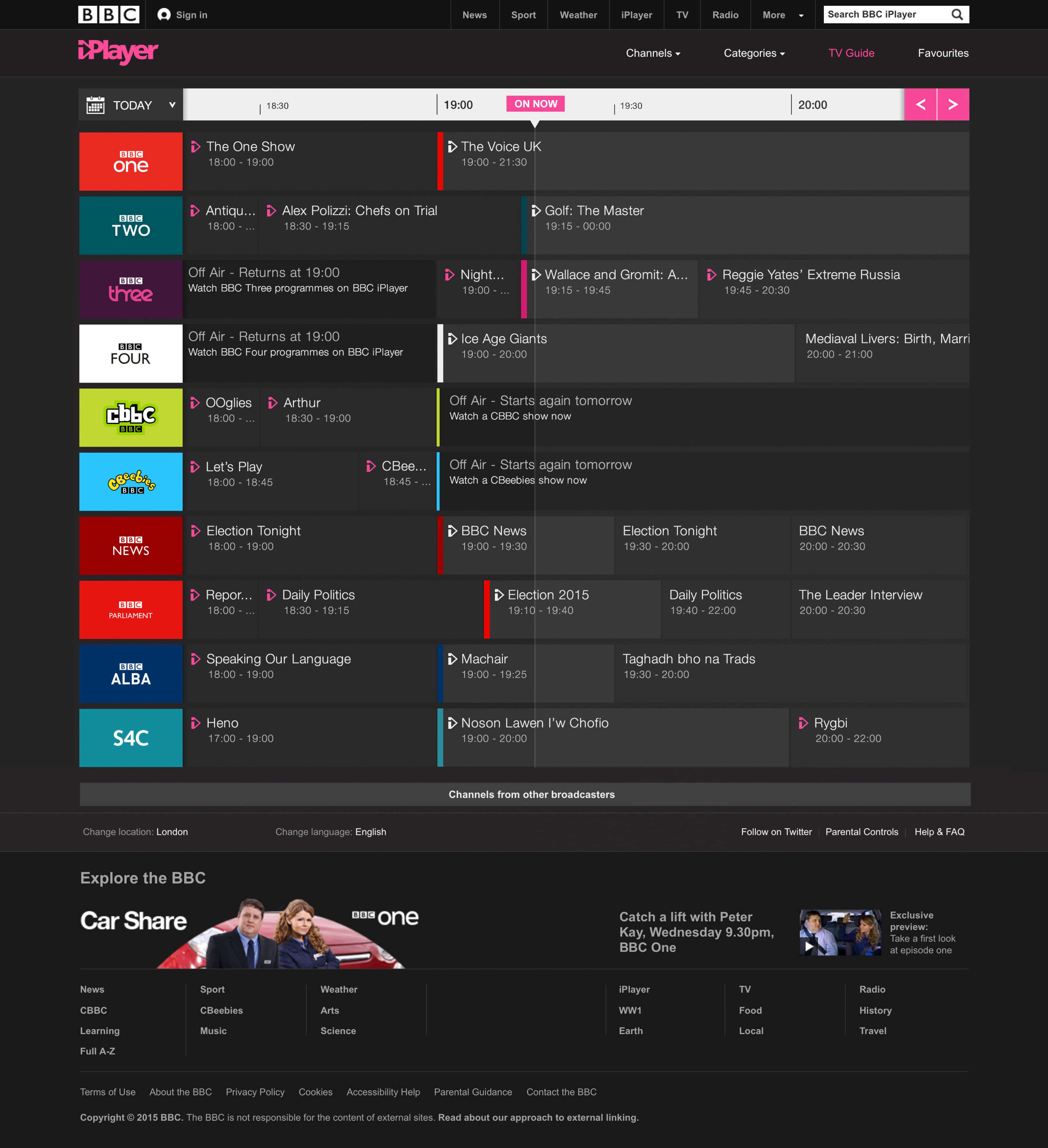
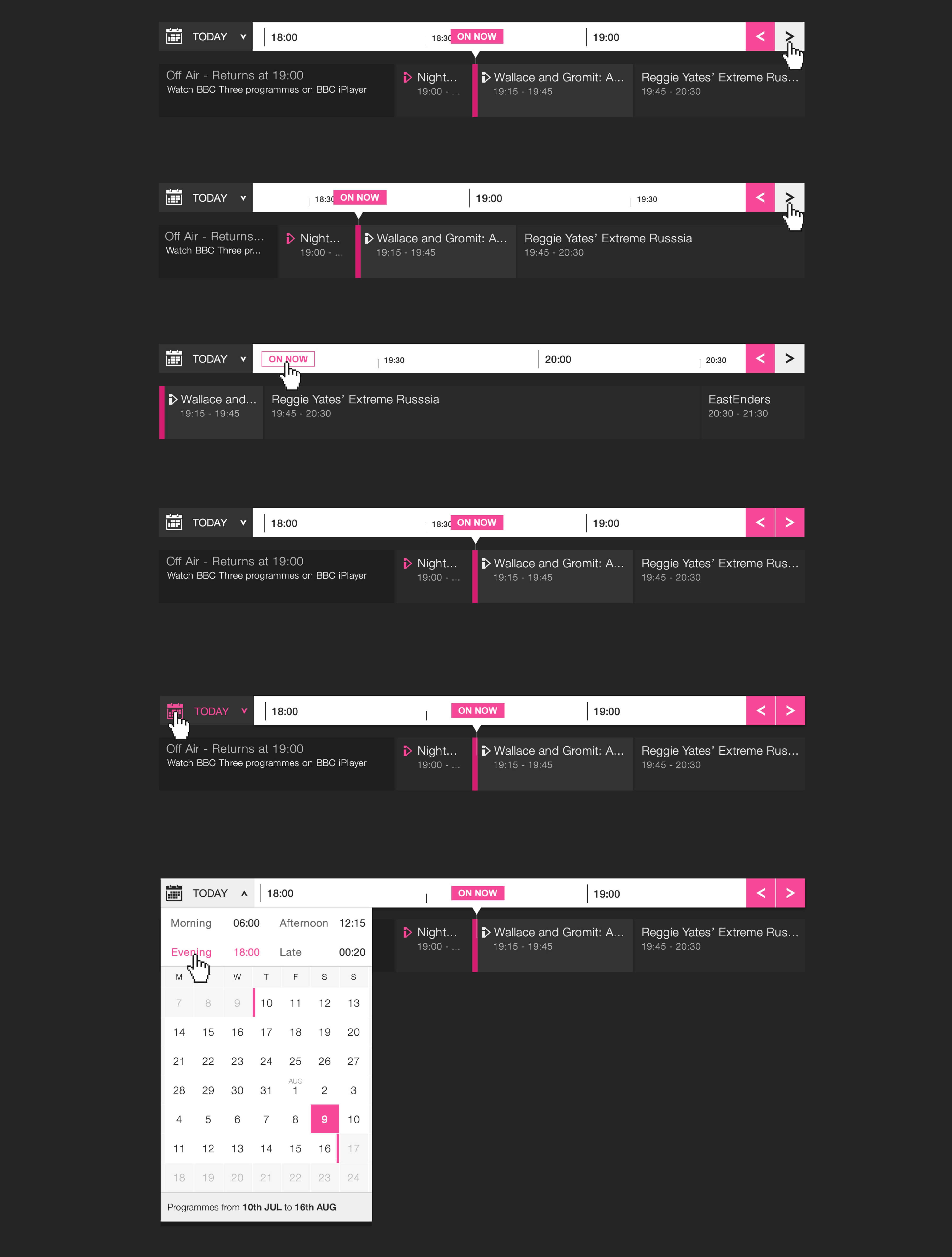
To address these issues, we made some changes, such as adding a line to the "On Now" badge, improving the "Full Schedule" link in the drop-down, adding a rollover state to the channel icons, and increasing the calendar icon size. We also combined the date picker and changed the links to "Yesterday," "Tomorrow," and "Weekend" to "Morning," "Afternoon," "Evening," and "Late" so that users could easily jump to sections on the TV Guide. Finally, we added a consistent link to "On Now" so that users could easily jump back to live, and the badge anchors to either the left or right of the time bar as users move away from "On Now.".
Some information and details are excluded due to confidentiality reasons.
Problem & Opportunity
During the last testing session, several issues were identified with the iPlayer TV Guide that needed attention. Firstly, there was a lack of differentiation between the background color for the "Off Air" cell and the "Programmes Available to Watch" cell, making it difficult for users to distinguish between them. Secondly, when hovering over the "Programmes Available to Watch" cell, the hover background appeared as dark grey, which was inconsistent with the rest of the design.
Another issue was that when the "More" panel was opened, it did not close when users scrolled through the schedule, causing a disruption to the user's flow. Additionally, the text "Off Air" was not sticky when users scrolled through the schedule, making it difficult for them to keep track of which programmes had already aired.
Moreover, the "Watch Live" programme was not sticky when users scrolled through the schedule until the end duration of that programme, causing frustration for users who wanted to keep track of the live programmes. Additionally, when the programme duration was less than five minutes or one minute, the cell looked abnormal, which affected the overall user experience.
In some channels, the "Watch Live" programme was not visible on the screen with the "On Now" line, making it difficult for users to find live programmes easily. Furthermore, the schedule transition was not smooth when users continuously clicked the navigation arrows, leading to a jarring experience. Lastly, the navigation arrows were not sticky when users scrolled the page up and down, which caused confusion and made it difficult for users to navigate the TV Guide.
Main challenge
The main challenge for the iPlayer TV Guide redesign was to enhance usability and accessibility. The team aimed to provide a more intuitive and user-friendly interface for users to access live programmes quickly and easily. To achieve this, they needed to provide a clear overview of the TV schedule, with special emphasis on live programmes.
Another challenge was to re-think the user's interaction with live programmes and make it easier for them to access all the necessary information about each programme. The team needed to ensure that users could find detailed information about live programmes quickly and effortlessly, without feeling overwhelmed or confused. To do this, they had to carefully consider the design of the TV Guide and the user's journey through it, with a focus on streamlining the user's experience and making it as seamless as possible.
My role
Senior User Experience Designer
Solution
As a solution, we made several improvements to enhance usability and accessibility of the iPlayer TV Guide. Firstly, we added a line to the 'On now' badge to make it easier for users to quickly determine what is currently on and for how long a show has been running.
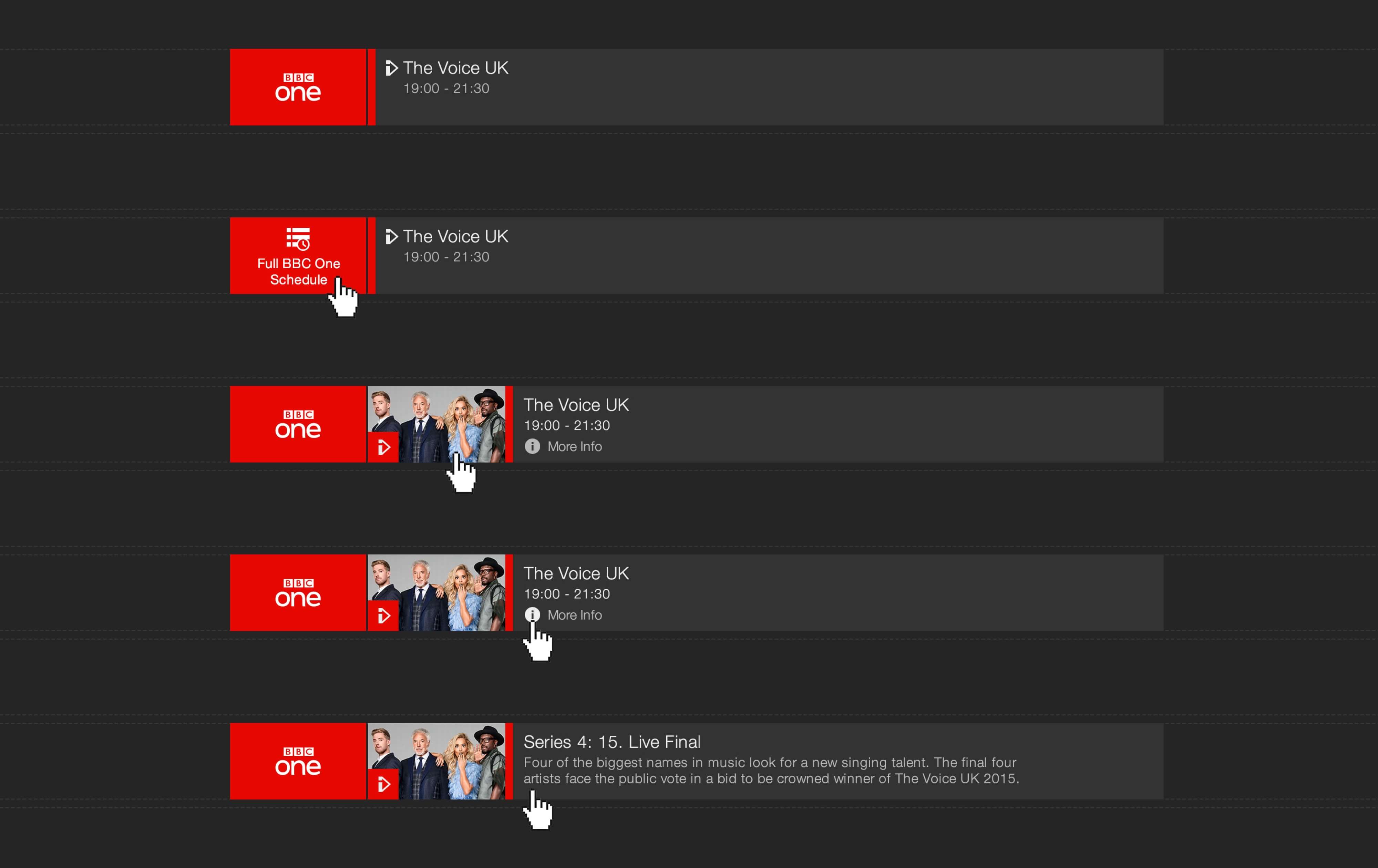
Secondly, we improved the 'Full Schedule' link in the dropdown menu to specify 'Full BBC Two Schedule', so users can clearly understand where they are navigating. We also added a rollover state to the channel icons to signify they are clickable links to the full schedule.
Thirdly, we streamlined the date picker by reducing the buttons to only one for changing the date. We increased the size of the calendar icon, which was initially too small in the research and easy to miss. Additionally, we included ordinal indicators (st, nd & th) to the date numbers.
By consolidating the date picker, we were able to modify the links to Yesterday, Tomorrow & Weekend to Morning, Afternoon, Evening & Late, allowing users to easily navigate to specific sections of the TV Guide.
Lastly, we added a consistent link to 'On now', enabling users to quickly jump back to live programming. As users move away from 'On now', the badge anchors either to the left or right of the time bar, ensuring it is always accessible.
The Project
Approach
Product Audit
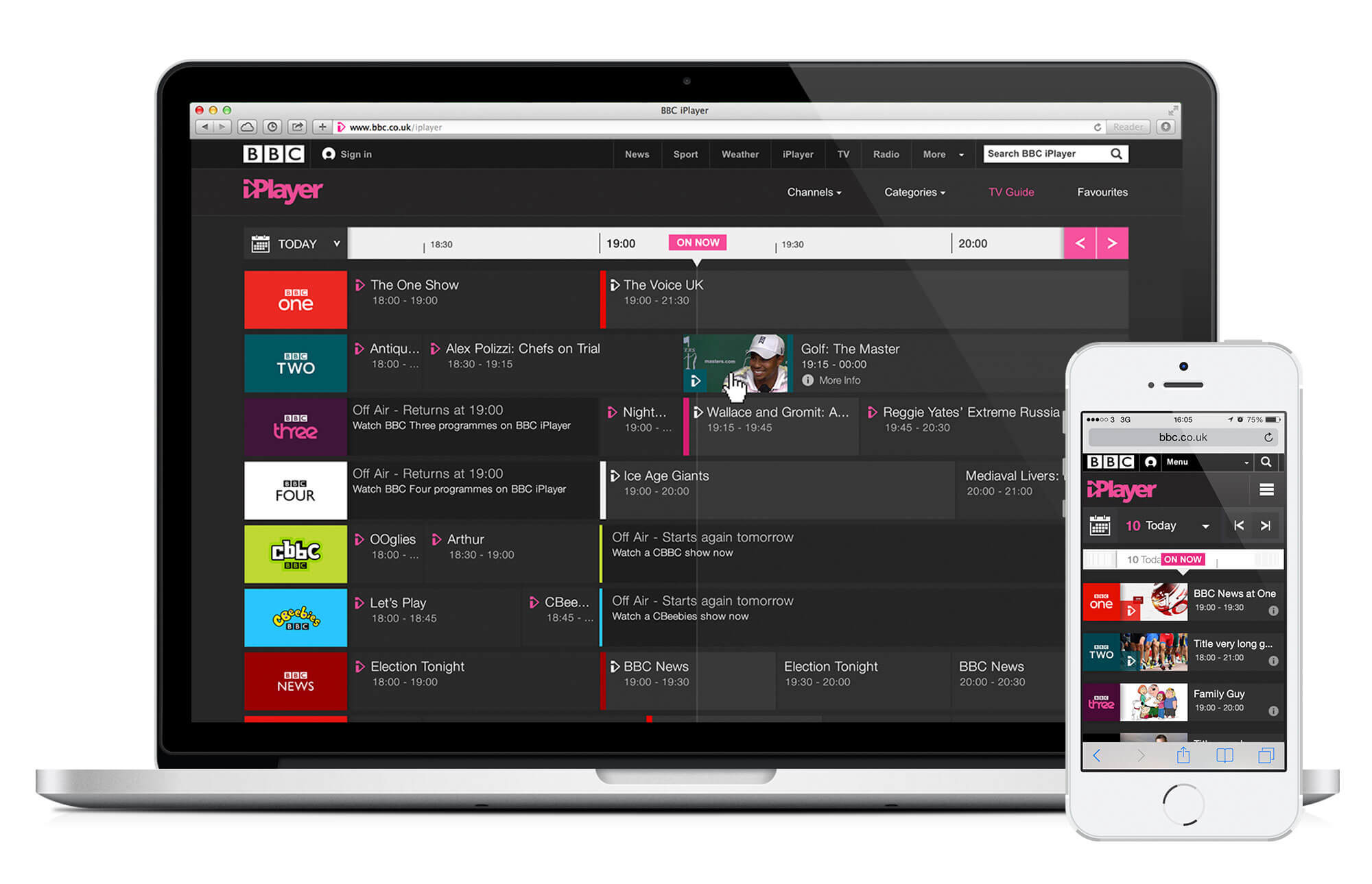
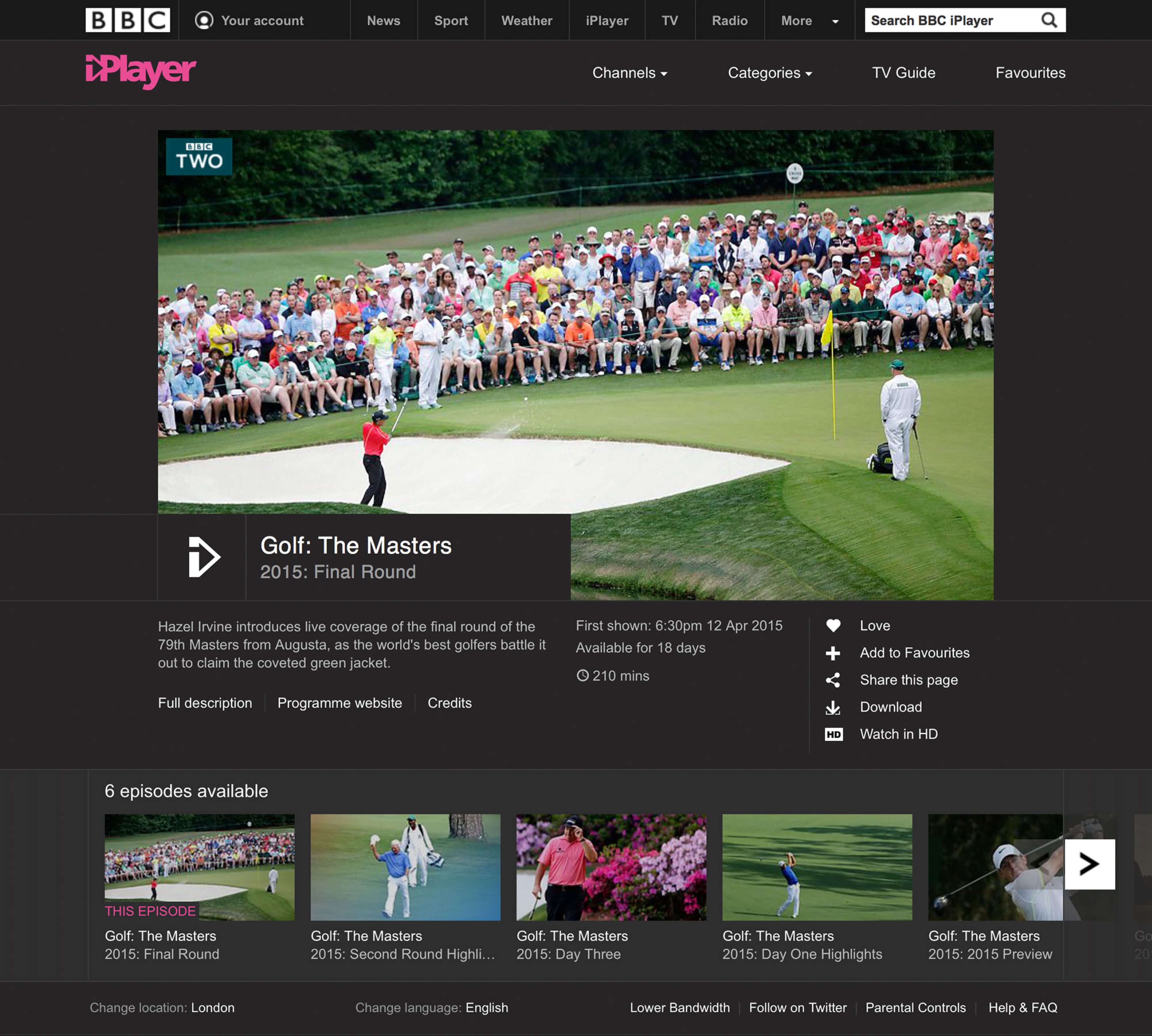
BBC iPlayer TV Guide is a digital platform that allows users to catch up on missed programmes from the past 30 days, as well as discover what's coming up in the next 7 days. This feature provides great value to users who may have missed their favorite TV shows or documentaries, allowing them to keep up with their viewing habits on their own time.
One of the most noteworthy features of BBC iPlayer TV Guide is its Programmes OnNow section, which offers real-time access to live TV programming. Users can access this feature by clicking on the "On now" button at the top of the page, which opens up a detailed schedule of what's currently playing on BBC channels. This is particularly useful for users who want to stay up-to-date with current events or watch live sports games.
Another notable feature is the ability to download programmes for offline viewing. Users can download any programme from the iPlayer TV Guide library and watch it at their own convenience without needing an internet connection. This feature is particularly useful for users who may not have access to a stable internet connection, or for those who want to watch their favorite programmes on-the-go.
The iPlayer TV Guide also offers a personalized viewing experience through its recommendation algorithm, which suggests programmes based on a user's viewing history. This feature not only helps users discover new programmes but also helps them find content that is tailored to their interests.
However, during our product audit, we identified some areas for improvement. One issue is that the "Off air" and "Programmes available to watch" cells have the same background color, making it difficult for users to differentiate between them. This can be particularly confusing when trying to navigate the TV Guide schedule quickly.
Additionally, some users found that the calendar feature could be improved to provide better functionality. Specifically, users noted that the calendar icon was small and easy to miss, and that having separate links for "Yesterday," "Tomorrow," and "Weekend" was not as useful as having links for "Morning," "Afternoon," "Evening," and "Late" sections.
Overall, BBC iPlayer TV Guide is a valuable platform for anyone looking to catch up on missed programmes or stay up-to-date with current TV programming. With a few minor improvements, such as clearer differentiation between cells and a more intuitive calendar interface, this platform has the potential to provide an even better user experience.
User Test and Research
Users had difficulty finding the live 'on now' section, and some suggested bringing back the pink line to help them locate it quickly. Users easily found the buttons for more information, program website, and adding to favorites, as well as opening the 'more info' panel. However, there was a mixed response to whether the drop-down panel should close or stay open when navigating away from the open item. Some users did not realize that the TV guide included non-BBC channels and expected all channels to be in the same place as on TV. Additionally, users found it challenging to navigate back to the 'on now' section.
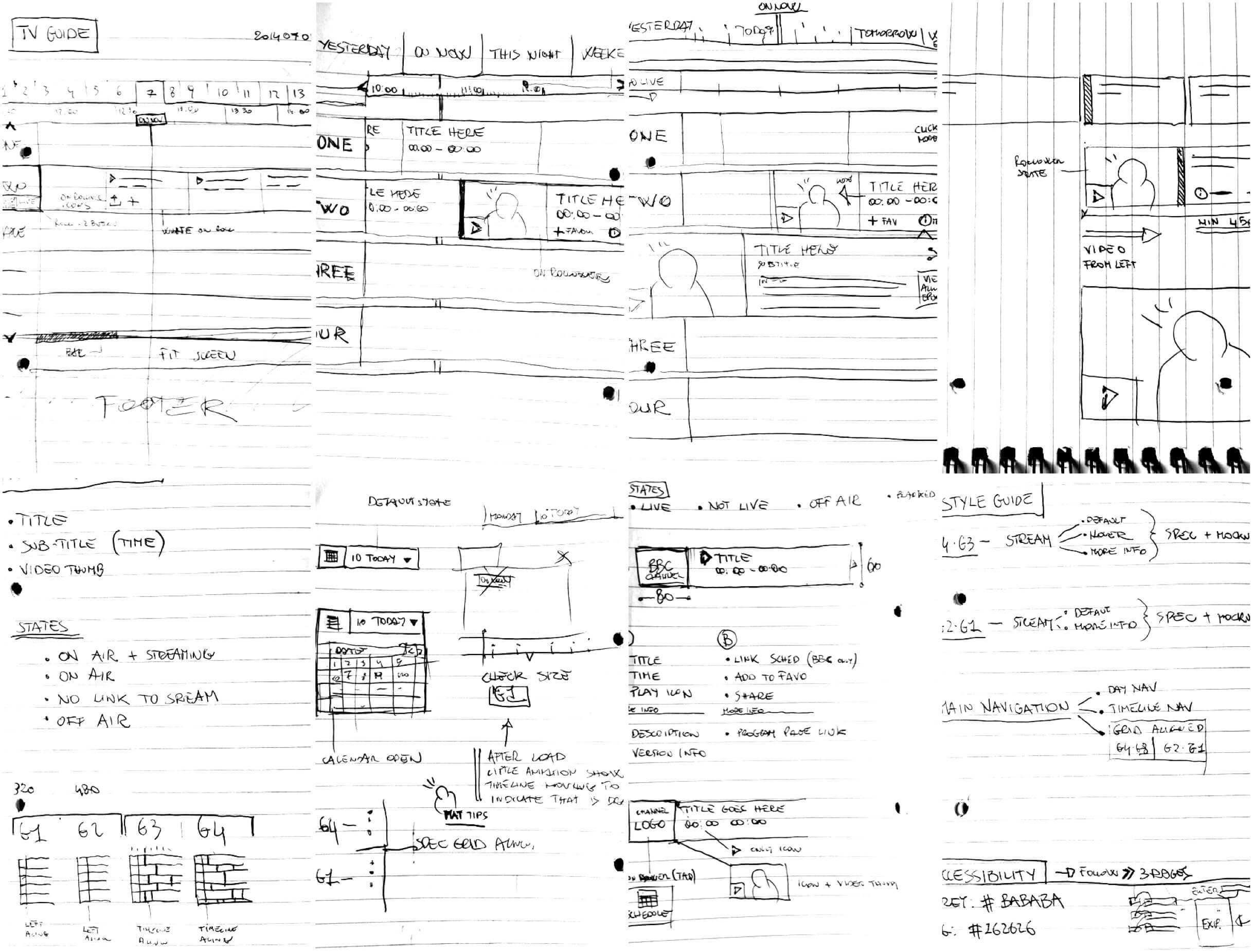
UX design
TV Guide Responsive Grid
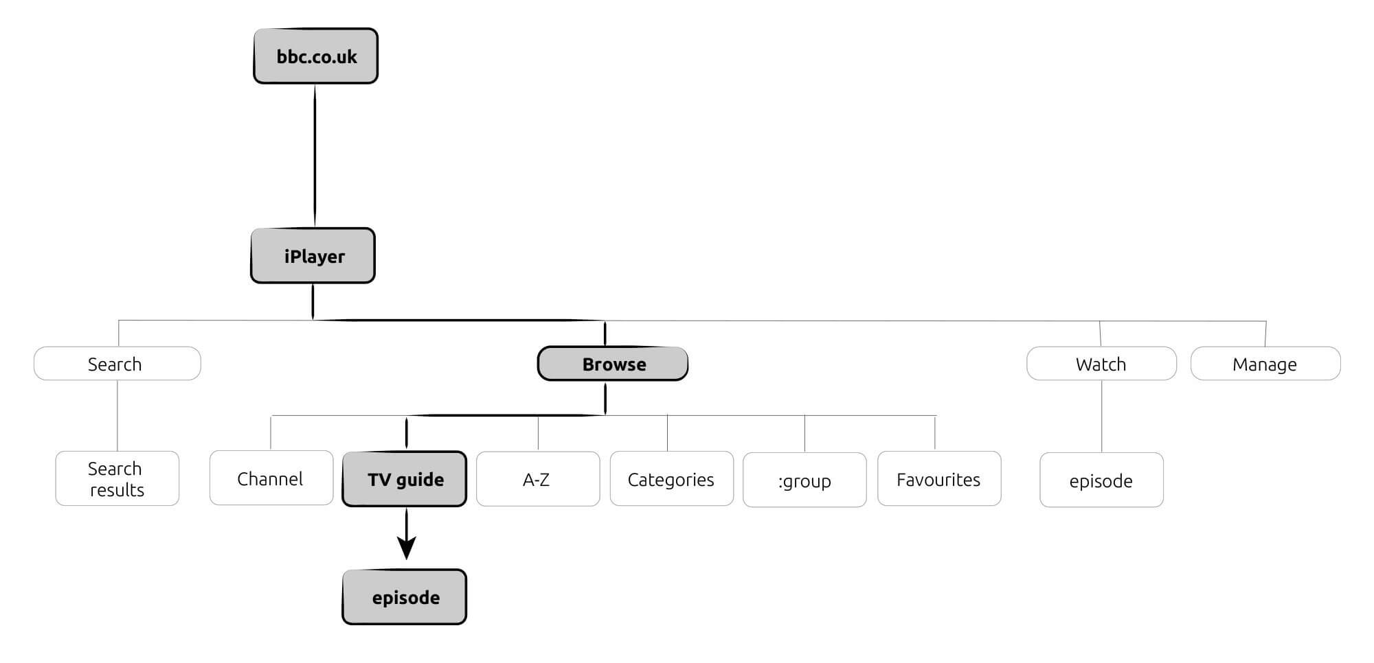
UX Architecture
Task models and Scenarios
UX Accessibility
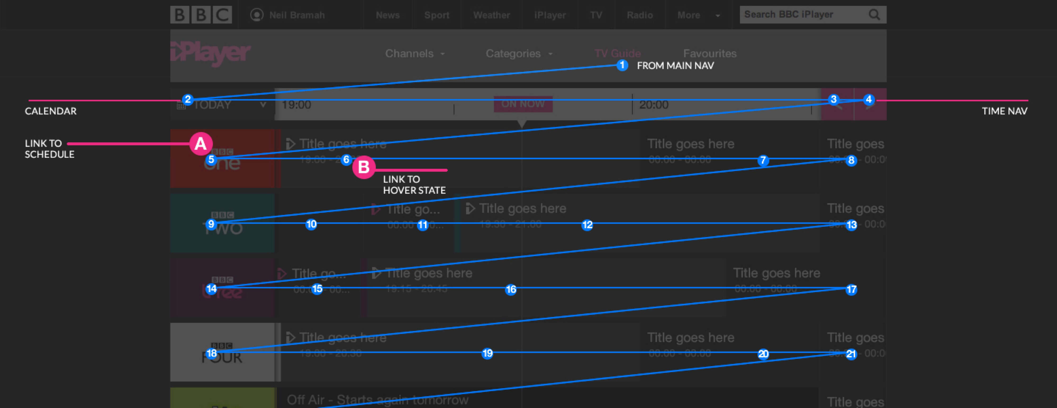
TV Guide Tab Navigator
UX design
TV Guide Interaction
UX Design
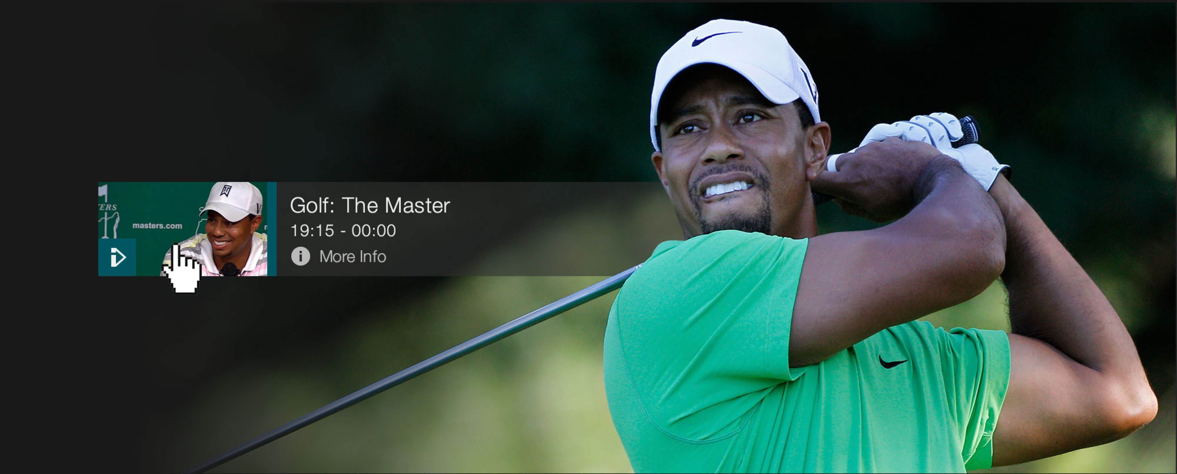
Live Programm Interactions


UX Design
Time Nav and Calendar Interactions
Learnings, results and outcome
The user test and research conducted on the BBC iPlayer TV Guide yielded several learnings that led to improvements in the guide's usability and accessibility.
One of the main findings was that users had trouble quickly locating the live 'now' programmes. While users could eventually find the programmes, it took some time, leading to confusion and frustration. To address this issue, the team added a pink 'on now' line to help users easily locate live programmes. This change was well-received by users and helped improve the guide's usability.
Additionally, users had difficulty navigating back to the 'On now' section after scrolling through the guide. To address this issue, the team added a consistent link to the 'On now' section that would anchor to either the left or right of the time bar as users moved away from it.
The research also showed that users found the 'More Information,' 'Programme Website,' and 'Add to Favourites' buttons easily. The opening of the 'More info' panel in the guide tested well with users. When asked to find the full schedule, users either clicked on the channel logo or link in the drop-down panel.
However, some users had difficulty locating non-BBC channels on the guide. Users who did not naturally scroll through the guide did not know that non-BBC channels were available. Some users also expected non-BBC channels to be located in the same place as they are on TV, such as BBC One, BBC Two, ITV, Channel 4, etc.
Another finding was that users had mixed responses to whether the drop-down panel should close or stay open when navigating away from the open item. Some users found it challenging to get back to the 'On now' section, as they had to do a lot of clicking.
Based on these findings, the team made several improvements to the BBC iPlayer TV Guide, including adding a pink 'on now' line, a consistent link to the 'On now' section, and making non-BBC channels more visible. These changes led to an improved user experience, making it easier for users to find live programmes and navigate through the guide.